6.22.21 • By Sabine Fryd and Shahd Husein
Visualizing stress for Mental Health Awareness Month
Visualizing stress for Mental Health Awareness Month
We don’t need to remind you that it’s been an incredibly stressful time for folks.
As a brand, we want to make sure that Oscar is a trusted resource for members, especially when they're seeking help. To achieve this, it's important we engage with our community by sharing information in accessible ways.With Instagram, we have the ability to create thoughtful, interactive content that helps us 1) get to know our followers better and 2) break down big concepts into digestible posts that we share over time.
So, for Mental Health Awareness Month this year, the Brand and Communications teams created a 4-part Instagram post and Story campaign highlighting the following topics:
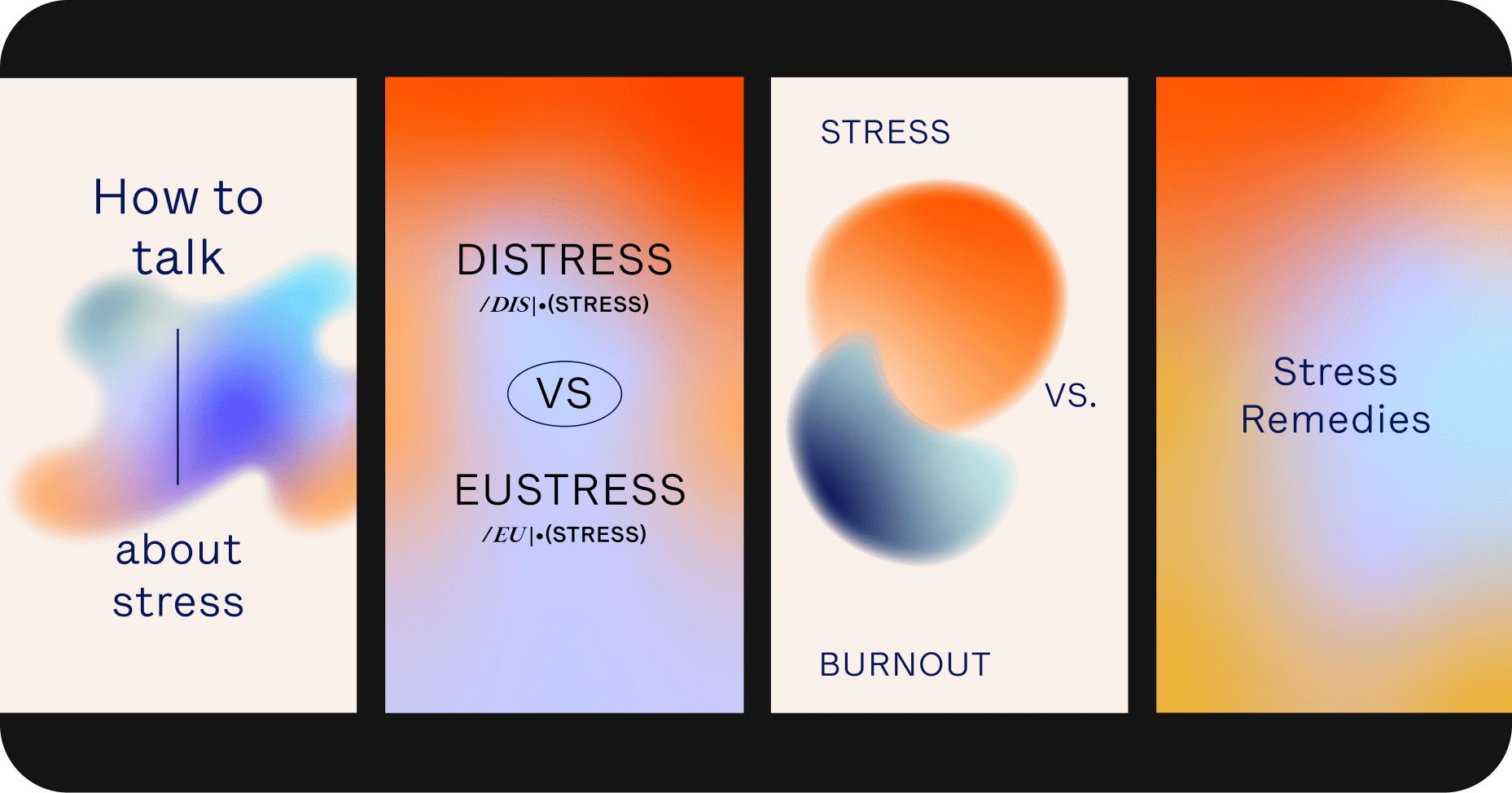
- How to talk about stress
-
Distress vs. eustress (aka “bad stress” vs. “good stress”)
-
Stress vs. burnout
- Stress remedies
 Instagram campaign overview.
From concept to design
To pull this all together, we first determined the goals of the campaign. What did we want people to take away when they interacted with these posts?We knew that we wanted to acknowledge stress and its different forms, to share high-level, educational tidbits, and to engage viewers with interactive content like polls, quizzes, and open-ended responses.
We leaned on a lot of our existing content—from our blog post on mental health resources to internal presentations on the difference between stress and burnout. Specifically, we worked with Charlotte Elkin, LCSW from Oscar’s Clinical team, to develop copy, ensuring that each slide in the post and Story carousel had meaningful information before moving on to design.
“Gradients could speak to the fluidity and abstraction of feeling, and play on an intuitive relationship between color and emotion.”
“Gradients could speak to the fluidity and abstraction of feeling, and play on an intuitive relationship between color and emotion.”
Evoking emotions with color and movement
A few words from designer Sabine Fryd:I knew I wanted to design something really impactful that could both visually represent the complexities of stress, but also feel empowering. In contrast to our core member communications, our social channels (especially Instagram) give us a great opportunity to make visually engaging, bite-sized content. That’s what made this the perfect space to play around with the flexibility of our branding (think colors, gradients, and shapes, oh my!).
I started by developing an overarching theme: gradients. This felt like a visual device that could speak to the fluidity and abstraction of a feeling, and could also play on an intuitive relationship between color and emotion (think hot reds and oranges for heat and stress, dark blues for calm and fatigue, and cool purples and yellows for lightness and ease).
The next step was taking that theme and figuring out how to create variations that specifically spoke to the content we had laid out for each post. We wanted each story to feel unique, but clearly part of a collection. After quite a bit of note taking, team brainstorming, drafting, and a lot of scribbling, here are the final story concepts.
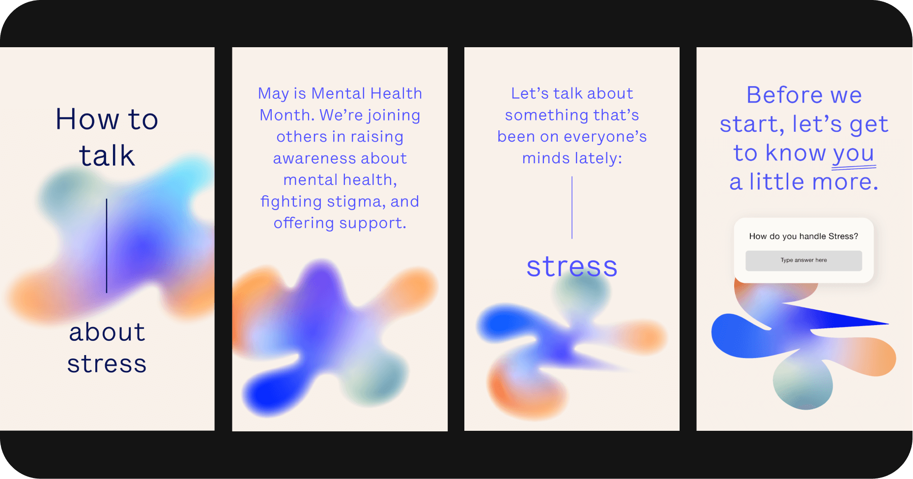
Story 1: How to talk about stress
Sometimes stress feels especially intimidating because we don’t even really know how to identify or express it. To me, that looked like an abstract shape, fuzzy and unclear in the beginning—so much so that you almost couldn’t even describe it or name it if asked.As this series progresses and we learn more about bringing stress into our consciousness and conversations, the shape suddenly becomes clearer and more concrete. As an added layer, we continue to see the gradient, full of different colors that drive home the idea that stress is still a fluid and complex feeling—even when we think otherwise.
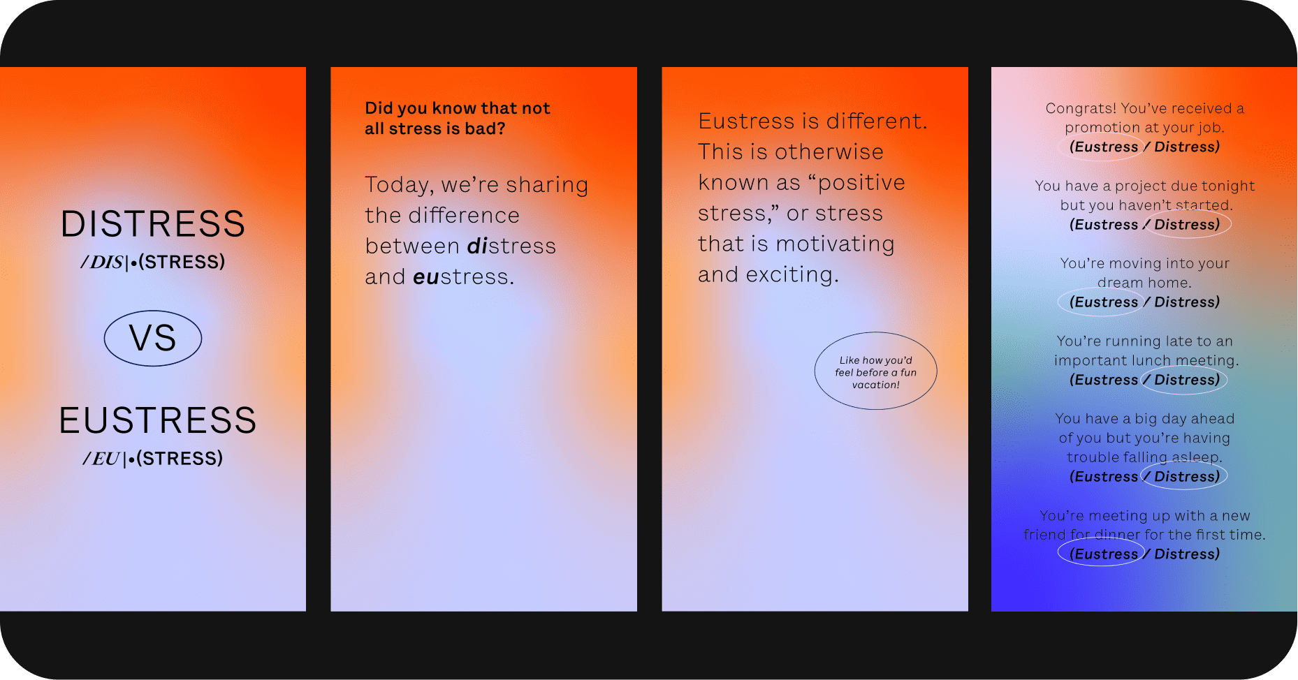
Story 2: Distress vs. eustress
Yes, stress actually can be good for you! You know the feeling (Nervous, but excited!). We really played on the relationship between color and emotions for this series, using the light purple to represent eustress and the hot red for distress.A big part of this topic's design was figuring out a playful and engaging way to demonstrate the topic, so we created a quiz that felt equally as playful as it did informative.
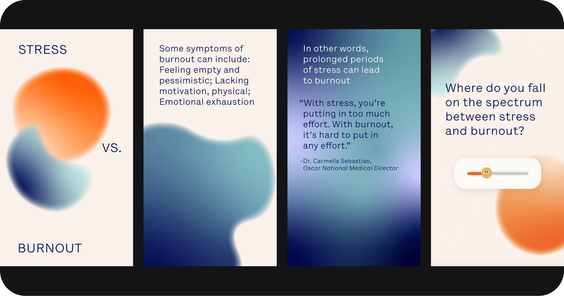
Story 3: Stress vs. burnout
Visually, we wanted to represent stress as a fiery hot red/orange ball (alluding to the association that we had started building in previous series), and burnout as dark and sleepy blues. At first, we can see that stress and burnout are two different things.As the story continues, we can start to see how prolonged stress is overtaken by the burnout colors, ultimately becoming an overwhelming and heavy horse of a different color right before our eyes.
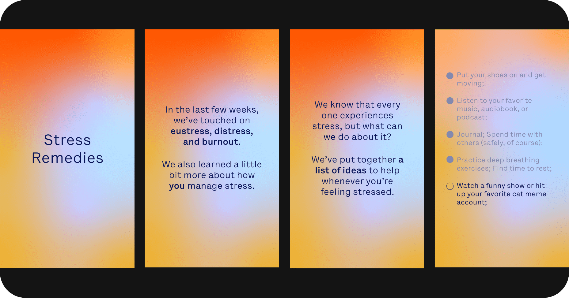
Story 4: Stress remedies
Throughout the campaign, we wanted people to take away little nuggets of knowledge, and we knew that ending with a list of suggestions would be the right direction. We really drove home the series by transforming the feeling of stress into something soothing and light. The colors change to suggest the end remedies will help to achieve that feeling of optimism.
Continuing our efforts
This campaign is just the start. We’re going to continue speaking out on important health issues on social media and experimenting with different imagery, shapes and typographic styles.If you want to help us spread the word, give us a follow on Instagram and Facebook (plus LinkedIn while you’re at it!)

©2022 Oscar Health