5.17.24 • By Yvonne Wang, Celina Leong, and Dan Ariniello
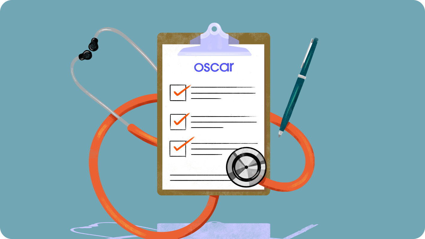
Design Audits: What and Why!

Intro
As a team, we’ve been exploring avenues to better define and maintain our design quality. One challenge we’ve encountered is that “quality” and what “good” means are subjective. To address this, we’ve been conducting design audits. These audits utilize methods with predefined guidelines and rubrics, e.g. heuristic evaluation to evaluate usability. This approach allows us to assess our current state of quality more objectively. Not only have these audits shed light on our design quality, but they’ve enabled us to effectively articulate and communicate our standards to a broader audience.
The authors — Yvonne, Celina, and Dan — contribute to various product areas at Oscar, working on external and internal-facing platform products. Our process shows that any team can find value in performing design audits.
The authors — Yvonne, Celina, and Dan — contribute to various product areas at Oscar, working on external and internal-facing platform products. Our process shows that any team can find value in performing design audits.
What is a design audit?
A design audit is essentially a health check for a product or parts of a product’s design, examining how well the visual and interactive components work together across every platform based on predefined criteria. This criteria can vary — from reviewing the aesthetics, color, and fonts, to error prevention, user control, and language. Performing an audit means taking a step back to ensure consistency in the visual style and usability of an experience.Why is a design audit important?
Each of us works across separate product areas, representing different user groups with unique challenges. Yvonne’s platform is for external brokers, while Celina and Dan solve for internal users focused, respectively, on prior authorizations and claims. Nevertheless, performing a design audit proved to be universally beneficial.
My team builds tooling to help brokers manage the policies they sell. As our understanding of the market and users deepens year over year, we see growth in this area and consistently launch new features to meet evolving user needs. Over time, the contributions from various designers mixed with an MVP-focused build approach have introduced a variety of design patterns. When looking at the product holistically, it became evident that there are a number of inconsistencies across features. While these might be easy to ignore individually, collectively they increase the time required to select the right design components and add to our tech debt, thus slowing us down.
![]()
My product area has historically had limited design support, with many one-off “band-aid” solutions built as necessary fixes. As an internal-facing application aimed at operational efficiency, it has continuously accrued noticeable usability issues and visual inconsistencies, alongside design and tech debt. Our audit allowed us to identify and log areas ripe with opportunities for improvement.
![]()
The area I support is currently benefiting from a renewed investment from the business. This extra attention affords us a great opportunity to take stock of the current experience, address legacy pain points, and take a proactive approach to mitigating risk as we expand. With an expected increase in user adoption, we wanted to capture all of the potentially risky areas, and make all appropriate updates, while we are getting ready for new users to onboard. This opportunity came at a great time for me as I had recently transferred into this area, and the audit proved invaluable to my onboarding.
![]()
My team builds tooling to help brokers manage the policies they sell. As our understanding of the market and users deepens year over year, we see growth in this area and consistently launch new features to meet evolving user needs. Over time, the contributions from various designers mixed with an MVP-focused build approach have introduced a variety of design patterns. When looking at the product holistically, it became evident that there are a number of inconsistencies across features. While these might be easy to ignore individually, collectively they increase the time required to select the right design components and add to our tech debt, thus slowing us down.

My product area has historically had limited design support, with many one-off “band-aid” solutions built as necessary fixes. As an internal-facing application aimed at operational efficiency, it has continuously accrued noticeable usability issues and visual inconsistencies, alongside design and tech debt. Our audit allowed us to identify and log areas ripe with opportunities for improvement.

The area I support is currently benefiting from a renewed investment from the business. This extra attention affords us a great opportunity to take stock of the current experience, address legacy pain points, and take a proactive approach to mitigating risk as we expand. With an expected increase in user adoption, we wanted to capture all of the potentially risky areas, and make all appropriate updates, while we are getting ready for new users to onboard. This opportunity came at a great time for me as I had recently transferred into this area, and the audit proved invaluable to my onboarding.

How did we conduct our design audits?
Holistic tool auditOur first step in the audit process was to define the goals and guardrails, and align with our partners in product on the areas most ripe for this evaluation. Recognizing that inconsistencies were present across the entire application, we agreed that a comprehensive audit of the full experience would offer the most substantial benefits. Both of us chose to conduct our audits referencing the heuristic evaluation as defined in Jackob Nielsen’s 10 general principles for interface design. Oscar’s design system (our library of reusable components and guidelines) served as an additional source for auditing design patterns.
Narrow UX flow + user interviews
For my product area, I chose to perform a focused audit on a specific experience within an application. Following the heuristic evaluation, I conducted a mix of group and one-on-one user interviews to validate my findings and make room for new ideas to surface. Together with power users, we performed heat mapping exercises to better understand the relationship of data presentation and business logic as it pertains to each workflow. Taken together, the heuristic evaluation, the interviews, and the workshops resulted in a wealth of insights for our team to look towards in the future.

Performing the audit
I developed a worksheet based on heuristics, turning them into specific questions for workflow review. I then rated our adherence on a 1-5 scale, noting both positives and areas for improvements. Alongside my notes, I included screenshots for clarity. Upon completing my audit, I summarized the findings using broader classifications - “major issue”, “minor issue” and “pass” — and color-coded them to further simplify the communication with stakeholders.
I chose to pair each finding with annotated screenshots in Figma, elaborating on why each was identified as a major or minor issue. Next, I organized these findings into a results table (shown below), highlighting the areas that needed the most improvement. I applied a similar method when performing a visual evaluation of the application to examine inconsistencies across layout, text hierarchy, grammar, and branding.
My evaluation was purposely limited to select experiences and workflows. As a result, I was able to go into great detail on each heuristic, documenting instances and patterns within scope that both met and failed the defined standards. I then prioritized the notes in order of greatest impact to user experience. Finally, I provided a macro rating of ‘Pass’, ‘Needs Improvement’, or ‘Fail’ as well as a granular letter grade (A–F) for the heuristic to better focus our attention.

Lessons learned and best practices
Be the driver of changeA detailed audit document can be far too extensive to digest in a single sitting. Designers have the opportunity to own next steps and negotiate for better UX practices by leveraging the audit outcome.
Visualize the narrative
A high level or macro score sheet paired with screenshots is more digestible and helps others visually learn the material. Sometimes, design, product, and engineering all see the same pain point but articulate it differently. A heuristic evaluation provides a framework for everybody to speak the same language.
It’s crucial for the audience to understand and visualize the usability issues, so I put together a slidedeck for easier digestion of the findings. Sharing this audit - whether it’s with your immediate team or the wider org - really underlines the importance of design consistency and allows us to advocate for all kinds of usability improvements with proof points.
Guide your team to the optimal solution
Performing the audit also allowed me to identify feature gaps, which I included in the findings deck. Thanks to this activity, I had a chance to examine the end-to-end experience, which highlighted clear gaps. The findings influenced our focus - both towards building out our backlog, as well as directly impacting our roadmap priorities.
Inspire partners
The share-out also inspired several other teams facing similar challenges to begin their own design audits, influencing how we communicate and tackle these kinds of quality issues.

Observed impact and next steps
Following the share-out, I collaborated with my product manager to prioritize and outline action items. Given our team’s recent adoption of a fix-it day process, where we allocate a day per month to addressing our tech debt, many small design inconsistencies are perfect tasks for these sessions. This allows us to incrementally improve the user experience. We've also set up a spreadsheet for tracking, making sure the results don’t get overlooked. The audit findings offered our product team valuable insights, helping them evaluate feature gaps and consider how these could be integrated into our roadmap.
There was no shortage of opportunity areas for our team to explore. Taking the scoresheet to prioritize the most troublesome components of our experience certainly helped refine our roadmap. One positive outcome is that our engineering team was inspired to dedicate greater resourcing to delivering the ideal user experience. We now have a significant chunk of time on the roadmap to address a lot of these weaknesses, plus even more that they have brought to the table. On a more personal note, I would say this project really helped push me to understand this particular area of my new domain.
To ideate on opportunities, I paired my audit findings with recent user research. Unsurprisingly, there were many parallels in the friction points mentioned by users and what was highlighted in the audit. Not only does an audit help keep in mind design opportunities (especially low-lift ones) when working on adjacent but unrelated improvements, but sharing these results across the pod encourages the team to value and incorporate usability and visual improvements in our future roadmap.
Wrap-up
As a design team, these audits are essential for maintaining our standard of quality. We’ve set up a working group focused on improving design quality, for which the audits served as a baseline evaluation framework. Our team is also exploring ways to make these audits more effective and accessible for every designer at Oscar. These include centralizing the audit process for consistent access, creating a shared pool of audit templates, and documenting best practices. Ready to embark on your own design audit? We hope the tips shared above will serve as building blocks and inspire you, especially if you find a design audit helpful for addressing specific challenges in your product and for improving design quality.
12.05.23 • By Madi Shultz
*This article was previously posted on the Oscar tech blog
A tool for finding the right method for your research question!
This story begins thousands of years ago in a hunting and gathering society. You are a hunter hoping to get lunch for the day, and you have built a tool to help. There are three “usability” outcomes we can expect.
(Caveman Lunch metaphor from the mind of Design Thought Leader, Rick Starbuck)
We know and expect these outcomes because the inventor, maker, and user of this tool were all the same person.
Fast forward thousands of years later, that’s no longer true. We (the people who build products and services in any context) have put distance between the inventor, maker, and user.
Put simply, distance = risk. Risk that people don’t want, like, use, trust, or derive value from the product. When we make product decisions, we can’t always intuit that they’re the perfect decision for our end user (like our prehistoric ancestors could).
This is the classic catchphrase of all human-centered design practitioners*: we’re often not the end user of the products and services we create. To reduce that risk, those same HCD practitioners (and any good UX researcher) will tell you to get as close as possible to your end users.
But here’s the rub — even when we get close to our end user, we won’t eliminate all the risk. We can’t perfectly predict how all users will behave all the time. Moreover, we don’t have endless time or money to spend on testing, and our users have limited time to spend with us. So, we have to get really good at reducing as much risk as possible in as little time as possible — and be comfortable with any amount of risk that remains for the product and experience decisions we make.
This is not a conundrum specific to Oscar. I’ve worked at a few health tech companies and feel confident in saying that we’re all dealing with risk and doing our best to steward research effort and time thoughtfully. I’ve also worked for companies where research teams are small, so we have to be scrappy and educate more people (product managers, designers, etc.) to think like researchers.
Our research team here is also small (though mighty!). But our questions are big, and our time is limited. It’s critical to identify the right question and the best (most efficient) way to explore it.
In research, we explore our questions with research methods. We might use qualitative methods, like in-depth interviews, or quantitative methods, like surveys. Preferably, we will use a few methods and layer the insights from them together, but it is very important to pick the right research method for the questions you’re exploring. Cue the UX Research Methods Map.

We created the Methods Map as a “first line of defense” to guide our teams as they explored new questions, assumptions, and hypotheses. At its core, the map is a decision tree that helps us consider the decisions we are trying to make, the types of questions we’re asking, and the amount of time we have to ask them. We see the Methods Map as a tool to democratize research within the Product organization. Think of it as a shortcut to making good choices about how to learn.
Like any good research project, it starts by constructing a research question. User research questions should guide every aspect of your study — who you recruit, the method you use, the analysis you perform, and even the results you share with stakeholders. By keeping the foundation of our study centered upon questions (instead of hypotheses), we open ourselves up to any answer and result we might find.
Layer by layer, the Methods Map helps guide you to the best method to explore your research question. The final result provides a description of the ideal method and the best way to get started.
Let’s pressure test it, shall we? Suppose, we’re considering moving into suburban markets, but we’ve built our digital tools primarily with urban users in mind. Specifically, we want to know the factors that are important to suburban members when searching for new providers. Our research question might look something like this — “What factors are important to members in suburban areas when searching for new providers?”

This is by no means perfect. There are always exceptions to every best practice. But we think this is a good start, and, importantly, the research team didn’t draft this from our own brains and ship it to other team members. We took a page out of our own book — beginning with discovery sessions to determine what we needed to build and performing quasi-usability studies to ensure we were building the right thing the right way.
In our work, we regularly make decisions that shape our members’ health and well-being, sometimes even their livelihood. We need to ask the right questions and diligently explore them with our end users, so we can give our members the healthcare they deserve. The Methods Map is one of the latest steps we’ve taken as a team to honor this commitment.
*Human-centered design (HCD) is a methodology that places the user at the heart of the design process. It seeks to deeply understand users’ needs, behaviors and experiences to create effective solutions catering to their unique challenges and desires. (Interaction Design Foundation)
Madi Shultz is a User Experience Researcher at Oscar, using empathy, rigor, and applied research methods to honor the needs of our end users and de-risk product decisions across member and provider experiences.
A tool for finding the right method for your research question!
This story begins thousands of years ago in a hunting and gathering society. You are a hunter hoping to get lunch for the day, and you have built a tool to help. There are three “usability” outcomes we can expect.
- You got lunch.
- You didn’t get lunch.
- Lunch got you.
(Caveman Lunch metaphor from the mind of Design Thought Leader, Rick Starbuck)
We know and expect these outcomes because the inventor, maker, and user of this tool were all the same person.
Fast forward thousands of years later, that’s no longer true. We (the people who build products and services in any context) have put distance between the inventor, maker, and user.
Put simply, distance = risk. Risk that people don’t want, like, use, trust, or derive value from the product. When we make product decisions, we can’t always intuit that they’re the perfect decision for our end user (like our prehistoric ancestors could).
This is the classic catchphrase of all human-centered design practitioners*: we’re often not the end user of the products and services we create. To reduce that risk, those same HCD practitioners (and any good UX researcher) will tell you to get as close as possible to your end users.
But here’s the rub — even when we get close to our end user, we won’t eliminate all the risk. We can’t perfectly predict how all users will behave all the time. Moreover, we don’t have endless time or money to spend on testing, and our users have limited time to spend with us. So, we have to get really good at reducing as much risk as possible in as little time as possible — and be comfortable with any amount of risk that remains for the product and experience decisions we make.
This is not a conundrum specific to Oscar. I’ve worked at a few health tech companies and feel confident in saying that we’re all dealing with risk and doing our best to steward research effort and time thoughtfully. I’ve also worked for companies where research teams are small, so we have to be scrappy and educate more people (product managers, designers, etc.) to think like researchers.
Our research team here is also small (though mighty!). But our questions are big, and our time is limited. It’s critical to identify the right question and the best (most efficient) way to explore it.
In research, we explore our questions with research methods. We might use qualitative methods, like in-depth interviews, or quantitative methods, like surveys. Preferably, we will use a few methods and layer the insights from them together, but it is very important to pick the right research method for the questions you’re exploring. Cue the UX Research Methods Map.
We created the Methods Map as a “first line of defense” to guide our teams as they explored new questions, assumptions, and hypotheses. At its core, the map is a decision tree that helps us consider the decisions we are trying to make, the types of questions we’re asking, and the amount of time we have to ask them. We see the Methods Map as a tool to democratize research within the Product organization. Think of it as a shortcut to making good choices about how to learn.
Like any good research project, it starts by constructing a research question. User research questions should guide every aspect of your study — who you recruit, the method you use, the analysis you perform, and even the results you share with stakeholders. By keeping the foundation of our study centered upon questions (instead of hypotheses), we open ourselves up to any answer and result we might find.
Layer by layer, the Methods Map helps guide you to the best method to explore your research question. The final result provides a description of the ideal method and the best way to get started.
Let’s pressure test it, shall we? Suppose, we’re considering moving into suburban markets, but we’ve built our digital tools primarily with urban users in mind. Specifically, we want to know the factors that are important to suburban members when searching for new providers. Our research question might look something like this — “What factors are important to members in suburban areas when searching for new providers?”
This is by no means perfect. There are always exceptions to every best practice. But we think this is a good start, and, importantly, the research team didn’t draft this from our own brains and ship it to other team members. We took a page out of our own book — beginning with discovery sessions to determine what we needed to build and performing quasi-usability studies to ensure we were building the right thing the right way.
In our work, we regularly make decisions that shape our members’ health and well-being, sometimes even their livelihood. We need to ask the right questions and diligently explore them with our end users, so we can give our members the healthcare they deserve. The Methods Map is one of the latest steps we’ve taken as a team to honor this commitment.
*Human-centered design (HCD) is a methodology that places the user at the heart of the design process. It seeks to deeply understand users’ needs, behaviors and experiences to create effective solutions catering to their unique challenges and desires. (Interaction Design Foundation)
Madi Shultz is a User Experience Researcher at Oscar, using empathy, rigor, and applied research methods to honor the needs of our end users and de-risk product decisions across member and provider experiences.
Designer Profile:
Zach Jarvis
In our Designer Profile series, we feature members of the Oscar design team. Step behind the scenes with talented designers working to make healthcare more accessible.
What do you do at Oscar?
“I lead design on our products that are responsible for running our core insurance operations, ensuring that through human focused solutions, we deliver effective and efficient operations. This is all in pursuit of Oscar's goal of making a healthier life accessible and affordable for all. From managing claims to ensuring safe and clean member information, "Core Insurance" is the heartbeat of our insurance company, leveraging best-in-class technology to enable outstanding member and provider experiences.”What is your WFH setup?
As a remote employee (based in Austin, TX), my at home setup is a constant obsession - I’m always looking for ways to optimize and upgrade my command center to enable me to do my best work, and play! Here’s the setup at the time of this blog post:
![]() 1.Mo Screen, Mo Better, 2.Mechanical keyboard, 3.Attempting to keep myself on time, 4.Great speakers, 5.A mic for that crispy audio, 6.A bigger computer for play, after I am done on the smaller computer for work, 7.Oscar MacBook Pro
1.Mo Screen, Mo Better, 2.Mechanical keyboard, 3.Attempting to keep myself on time, 4.Great speakers, 5.A mic for that crispy audio, 6.A bigger computer for play, after I am done on the smaller computer for work, 7.Oscar MacBook Pro
 1.Mo Screen, Mo Better, 2.Mechanical keyboard, 3.Attempting to keep myself on time, 4.Great speakers, 5.A mic for that crispy audio, 6.A bigger computer for play, after I am done on the smaller computer for work, 7.Oscar MacBook Pro
How did you get into product design?
“After graduating with a degree in Marketing, I quickly realized that it wasn’t quite aligning with my passion and interests. During my time in school, I had worked as a graphic designer, a role that allowed me to flex creatively but wasn’t where I wanted to be long term. As I ventured into the professional world, the emerging field of UX design caught my attention. It wasn’t a well known career path to me at the time, but it resonated with the blend of my creative skills and business education. I spent the next year reading, practicing, and failing in many interviews; I honed my skills and eventually landed a role at a small startup. This experience opened doors to opportunities at various SaaS and enterprise software companies, where I continued to refine my expertise, focusing especially on creating intuitive and user-friendly products for internal teams. Now leading designers that focus on that same mission here at Oscar.”
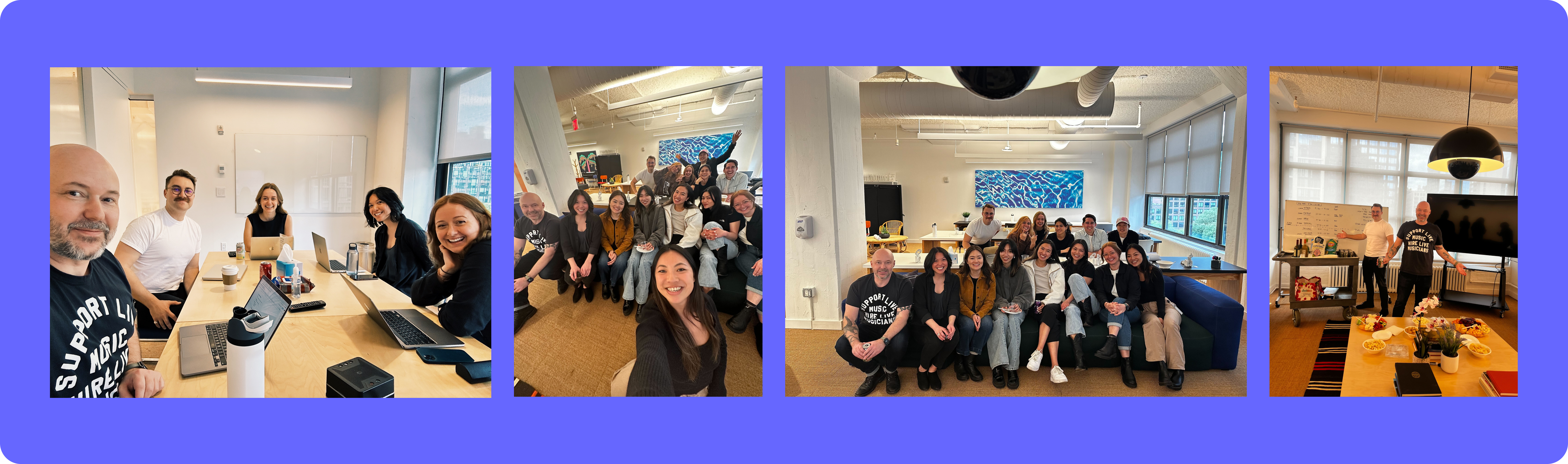 Product Design Team at our 2023 Onsite.
Why did you join Oscar? What made you stick around?
“I joined Oscar after several years in the healthcare technology world, a sector often not seen as a leading space for technology. My experiences with Medicare Advantage SaaS products and brokerage agencies ignited a passion for improving healthcare from the inside. Oscar piqued my interest as it radiated a distinct energy, a mix of innovation and dedication to reinventing healthcare. While interviewing I could see that it was the right place for me, not only to work towards the goal of changing healthcare, but a place where I would be challenged by those around me to grow in my own career.Being part of Oscar isn’t just a job. It’s a journey into uncharted waters of innovation, a collective effort to turn the tide in healthcare. Each day confirms the magic, the Oscar Magic, I sensed during those initial interviews – a team not just working but evolving together, shaping a narrative that extends beyond the walls of our “office” to every individual seeking quality, compassionate healthcare. The excitement isn’t just in the groundbreaking work we’re doing but in witnessing real-time the impact of our innovations, the lives touched, and the systems transformed.”
07.13.23 • By Trevor Murphy & Ian Bernstein
*This article was previously posted on the Oscar tech blog
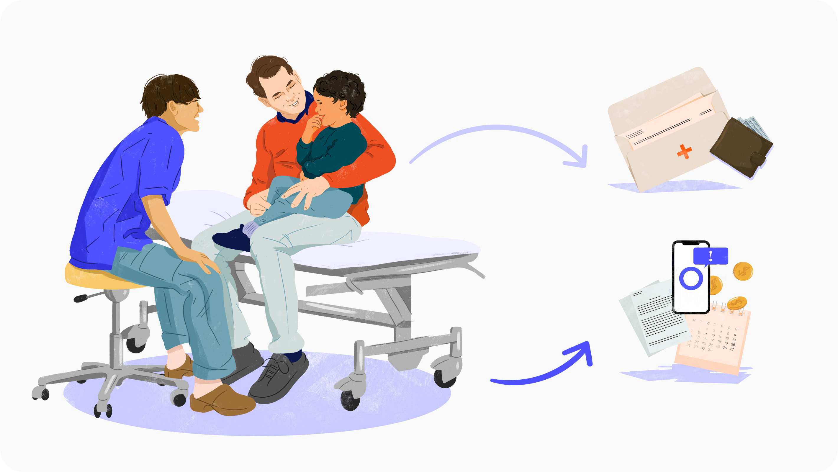
It’s no secret that healthcare in the US is confusing and hard to navigate, even for those of us that work in this industry!
There are many obstacles in an individual’s journey through the healthcare system, but among the largest is understanding how claims work. In service of Oscar’s mission to make healthcare more accessible, we decided to take a deeper look into how our customer service teams support our members as they attempt to better understand the claims lifecycle. All Oscar members are supported by our Care Team, allowing them to call in and get help with any issues or questions they may have about their insurance.
After analyzing phone calls between members and their Care Teams, we noticed that claims-related topics consisted of 16% of calls to Oscar, and these calls were among the longest and most complex for our teams to manage. The Care Team is staffed with Care Guides who leverage a homegrown inbound support tool called Rosco to help answer member questions. In order to better support our Care Guides in answering member questions related to claims, we embarked on a multi-pronged Rosco enhancement initiative which has led to positive feedback from our Care Guides.
Throughout this post we’ll explore how we landed on the claims lifecycle as a problem to solve and take you through our process of aligning on the right solution to help our Care Guides successfully explain/navigate the confusing claims landscape for our members. Building software is nothing if not collaborative so in that spirit Ian Bernstein, the Product Manager for this project, and Trevor Murphy the Designer, will partner to walk you through every step of our journey.

Problem
There are countless quality of life improvement related problems to tackle at Oscar, so why invest the time and resources into streamlining the claims experience for our Care Guides? To answer that, it’s first important to understand that Oscar is a technology first company where we own the entire stack of technology we use, and part of that is building our own custom solution for claims processing. This new solution is the result of a long development process, but it now enables us to effectively scale our business, takes advantage of many administrative efficiencies, and establishes a strong foundation upon which we can continue to differentiate and build innovative capabilities. Our brand new claims system was ready for rollout which meant that the timing was serendipitous for us to unlock everything the new platform had to offer, including enabling our Care Teams more visibility into claims in Rosco.There were two primary reasons to dig further into how Rosco would support the the new platform change
- We realized that the infrastructure was aging and needed a refresh, and
- Claim calls can be complex, and they have always been longer in duration and more difficult to handle than other types of member or provider inquiries.
Claims are submitted after a procedure is conducted. They get processed through our system based on eligibility and codes submitted to a payer from a provider. The claim can then be updated over time as well through adjustments as a provider shares new information like updated codes, medical records, or submits for retroactive prior authorizations. These nuances make it more challenging for our Care Teams to accurately represent to members how a claim moves through the lifecycle.
User needs
We knew the front end of our application was going to need to be updated to support this new claims processing system. This offered the perfect opportunity for us to invest in understanding our Care Team’s needs more deeply and learn where the current experience was painful or needed improvement. We began this fact finding mission moving up the initial edges of the double diamond design process in an effort to cast a wide net and learn all we could. We started by conducting group sessions with Care Guides to gather an initial understanding of the space. We then set up time to shadow live calls that Care Guides were fielding from members to see how Rosco was being used, set up one on one interviews for deep dives, and sent out surveys to all teams that would be impacted by our work. We also worked directly with internal teams to get a better understanding of what information was available today and what new data we could begin to leverage once our migration was complete. Through all of that we learned a lot and were able to align as a team on the four largest problem areas to solve for:1. Historical adjustments made to claims are hard to understand:
There are times where a claim may need to be processed again and some back and forth is needed between a provider and a payer. This results in a claim changing over time and the original tool we were using didn’t effectively assist our Care Team in visualizing and explaining these changes to our members.
2. Lack of a holistic picture creates a disjointed experience:
Oscar’s initial claim system was hyper focused on medical claims and that same focus was apparent in the tooling our team was using. Our users were asked to leverage external tools from our Pharmacy Benefits Manager in order to answer member questions related to pharmacy, which added time and complexity to calls.
3. Member expectations don’t align with how claims were processed:
An individual navigating healthcare expects the date they received care to be the date that claim was processed, but the fact is that claims can be delayed for any number or reasons resulting in a misunderstanding of how something like a deductible was impacted.
4. Raw data available in Rosco requires manual synthesis to answer members questions:
Our tooling was focused on delivering the data from a single claim, but where it came up short was in helping to translate that data into knowledge that our team could use to answer member questions. We wanted to make it easier to answer simple questions like, “when did I meet my deductible?” without forcing our team to jump through hoops.
Pulling pieces together
To tackle a problem as massive as this one, we needed to work cross functionally, involve our users, and wrangle complex data.
Our Care Team users that were impacted by the changes within our claims experience were instrumental throughout this project. We had frequent conversations with our users on changes we were experimenting with to ensure the changes aligned with their needs before they were implemented. We were in lock step with our stakeholders so they knew what to expect before the changes were implemented and could therefore successfully prepare for the change.
- Cross team collaboration: We worked closely with the teams that own claims data, our customer service team users, and the technology teams. The information we display in our Care Team application is only as good as the data we get from the teams that provide it to us.
- Involving our users: We worked extensively with our internal teams to ensure that as they were building the new claims processing system, they were building with the business and the user needs in mind. It’s very easy to get lost in building a complex system and finding out afterwards that the system isn’t helping the front line teams that need it the most, so we sought to remove those obstacles through constant communication and incremental builds.
- Wrangling complex data: There is a lot of data associated with getting a claim processed correctly. We needed to work closely with our technology teams to make sure that we could successfully pull in data from various sources and ensure the front end experience wouldn’t break. We constantly asked ourselves how we could build the front end experience in a way that uses microservices to solve our pain points, reducing the load on the system that would be necessary to display the critical information for our users.
Our Care Team users that were impacted by the changes within our claims experience were instrumental throughout this project. We had frequent conversations with our users on changes we were experimenting with to ensure the changes aligned with their needs before they were implemented. We were in lock step with our stakeholders so they knew what to expect before the changes were implemented and could therefore successfully prepare for the change.
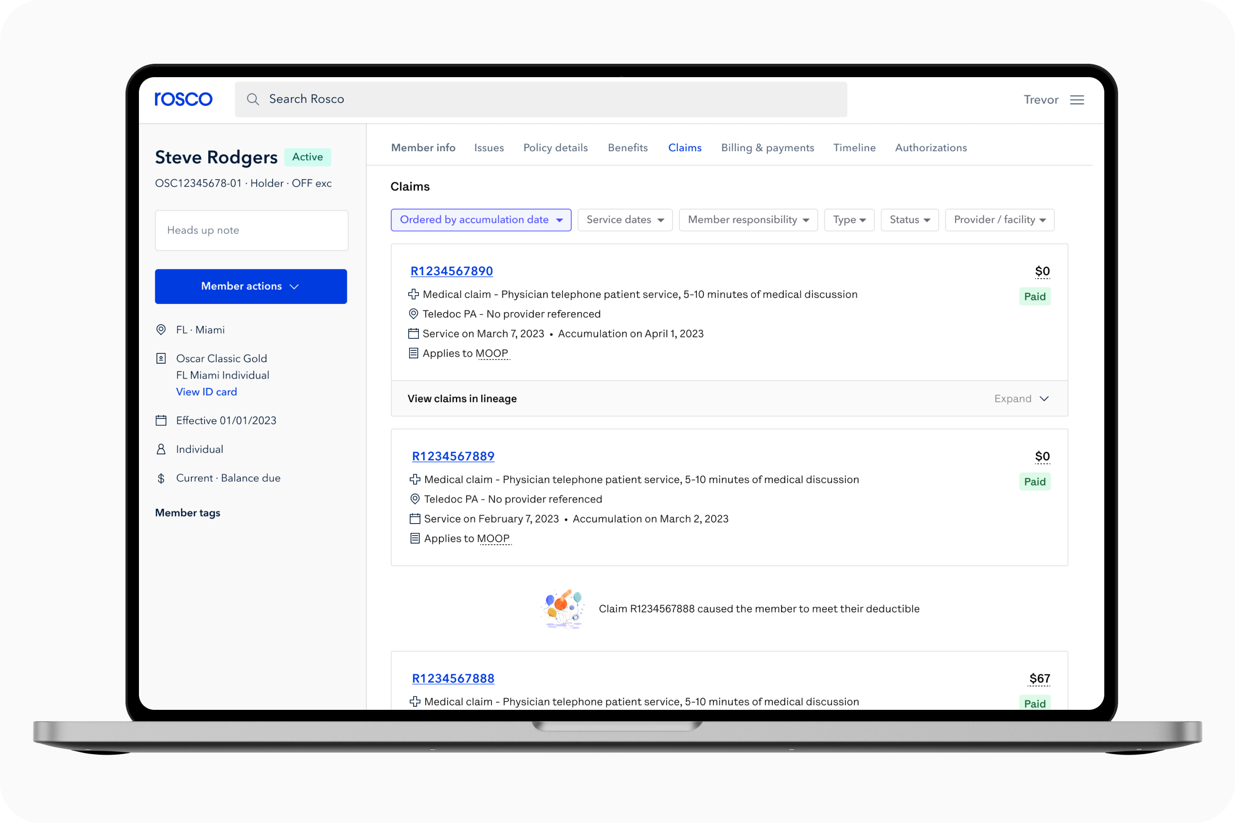
Updating the UI
After a thorough series of iterations and testing we finally arrived on an update to our existing solution that honed in on solving our users’ pain points. The tool we were designing for wasn’t one we personally use every day, so putting ideas and new designs in front of actual end users to gather insights and feedback was a crucial part of our journey in making claims easier to understand.
Change number 1: Cards > Tables
We opted to move away from a table based solution and instead custom built cards designed specifically for claims. These cards now surface all relevant information that was initially hidden behind a click and allow the Care Guide to locate a claim quickly. Additionally, data is now placed in a consistent vertical view area which makes it easy to scan while scrolling down the page.
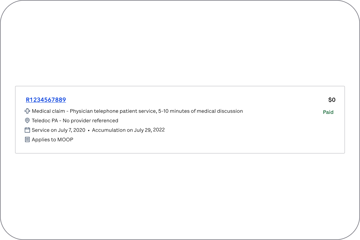
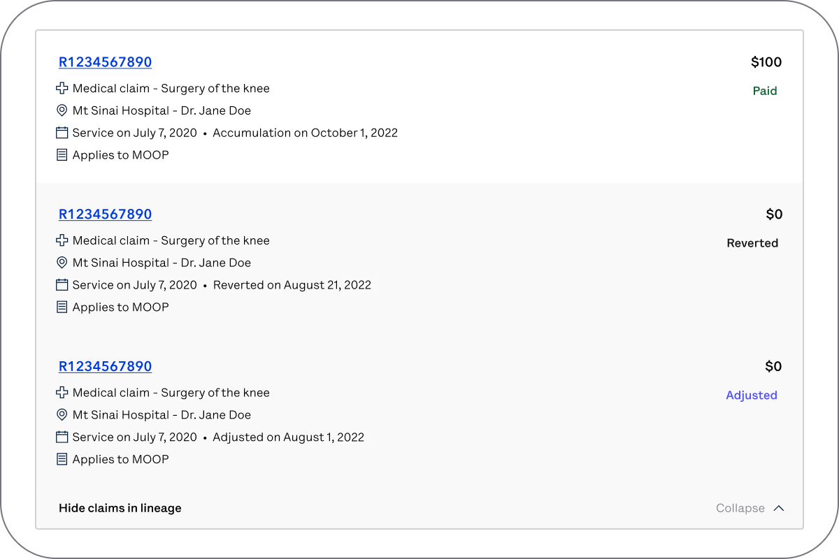 Change number 2: Collapsing adjustments
Our claims card now has the ability to collapse historical information behind it so rather than having a new claim for each possible adjustment, now the most up to date information will always be shown up front while the historical context is a click away.
 Change number 3: Answering common questions
To create a clearer connection between the claims themselves and a member’s accumulators (deductible) we now show what we’re calling a ‘pillow’ UI to help take some of the guesswork out of the equation. The pillow tells someone the outstanding balance of a deductible and once met is a secondary affordance that will eventually point the user to the claim that caused it to be met. Further down the page our claims can now be sorted not only by date of service, but also by the date the claims processed. This makes it easy for us to now surface in-line notifications amongst our claims which focus on calling attention to key events, like when a deductible was met.
 Change number 4: Support for non medical claims
With new service support available, showing a holistic picture of a member’s care was now possible so we adjusted our claims card to support it. Relevant pharmacy data becomes available in claims cards and new iconography helps a user understand claim type. Vision, dental, and mental health services are all covered in this same way!
What does impact look like
To ensure that what we built was providing value to our users, we leveraged two primary metrics to assess impact:- Successful completion of our back-end migration such that we only rely on the new infrastructure/system for our claims experience. This creates a more reliable system/experience for our users and enables us to implement new UI changes to solve major pain points.
- Improvements in overall efficiency for our users that interact with the new claims experience. We worked closely with our Data Science team to discuss metrics we could track to analyze the success of this project. We were hoping to achieve a reduction in the number of inquiries that get escalated to another team to solve as well as a decrease in the amount of time it takes a user to answer claim related questions.
Given how closely tied these success metrics were to Oscar’s overall goals of reducing confusion for members and costs of running our business, we were able to successfully prioritize this work in our annual product roadmap. Since March of 2022, we’ve been releasing changes in phases and testing how each phase impacts our core metrics as a part of our build, measure, learn product cycle.
Pilot and change management
Although we had reasonable confidence that we built the right thing, we wanted to make sure we had controls in place to ensure our new features worked well for our Care Guides. We created one last round of feedback in the form of a beta launch. We worked with our stakeholders to identify a diverse set of beta users so we could have assurance that the solution was working for all users, since many of our users have different needs.This pilot group was used for a tight change management approach. These users had access to the new solution for two months to ensure the functionality was working as expected and give them an opportunity to provide feedback. We created a test and control group across this group and all other users to help us measure the effectiveness of the new design.
Then we reviewed the feedback, and were able to make changes to the functionality before launching to all users. Simultaneously we monitored our core metrics to ensure that pilot users were experiencing a reduction in call time which has positive impacts on service performance.
Out in the wild
We are continuing to gather feedback so we can make the experience even better and are monitoring the data so we can ensure the claims experience is continuing to yield positive benefits.Looking ahead, we’re also planning to incorporate AI as we highlighted in our continuous hackathon site.
This project is only one of many that we are focused on that addresses internal tool enhancements to drive business value by improving the experience of our stellar Care Teams that are on the front lines with our members every day. Although we are only a piece of the puzzle, we are excited to be doing our part and help Oscar achieve profitability and reduce the complexity of the US healthcare system for our members!
Trevor Murphy is a Senior Product Designer, currently leading design for all teams in the Provider & Clinical space. Previously supported design needs for our customer service tools.
Ian Bernstein is a Product Manager at Oscar, working on our Customer Service tools.
03.24.23 • By Dar Min
A year in the life of a product designer at Oscar
A year in the life of a product designer at Oscar
I joined Oscar one year ago as an Associate Product Designer for our Digital Member Experience. What drew me to Oscar was the brilliant design team behind the mission of making a healthy life accessible for all.
The Oscar design team holds a monthly meeting where our friends from brand and product design do a lightning round to share what we’ve all been working on. It’s a great way to learn what other designers across Oscar are currently solving, while promoting team spirit and transparency into each other's worlds.
As my Oscar-versary rolled around, I wanted to look back and reflect on all the things I’ve experienced. I noticed that what I’ve shared during these meetings gave me a pretty good snapshot of my accomplishments. Here are some highlights from this year since I’ve joined.
April
In my first project, I tackled adding timelines to provider-assigned tasks. This was a great way to get acquainted with the member experience and the different ways we aim to make healthcare more understandable.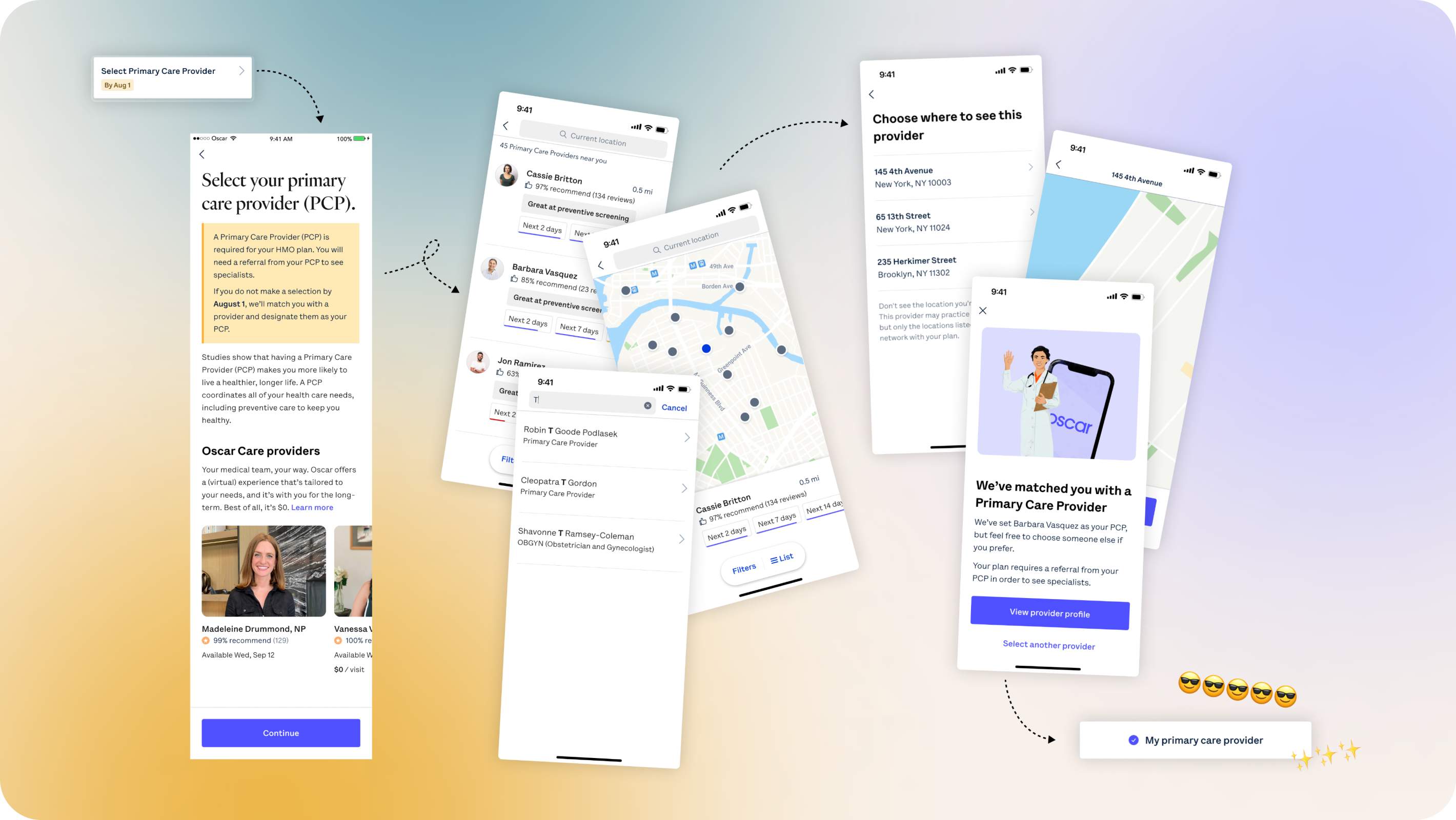
May
In May, we focused on improving primary care provider (PCP) attribution rates across our member base. Fostering a relationship with a PCP is proven to help patients live a healthier, longer life – but our members seemed to be unaware about all the benefits. The solution was to imagine how a member could select or change their PCP right from the Oscar app.
July
In July, my team’s priorities shifted towards creating tools that make the healthcare system more transparent while clarifying any confusion our users may have about their insurance plan. As part of this transition, I conducted a workshop to help brainstorm a new team name – we agreed on Trust & Transparency.
We wanted to gain foundational knowledge on our members to help us embark on this journey, so I got started by writing this interview script.
We wanted to gain foundational knowledge on our members to help us embark on this journey, so I got started by writing this interview script.

August
In August, I synthesized the findings from our interviews with Oscar members. This was my first time getting to talk to the end user here at Oscar – it was invaluable in helping me understand who I was designing for, what motivates them, and what opportunities we have to meet their needs. 
October
In October, I designed some experiments to better understand our member’s attitudes towards self-service, or their tendencies to find an answer themselves without involving customer service. Above are some explorations on how we thought about surfacing resources within the messaging flow.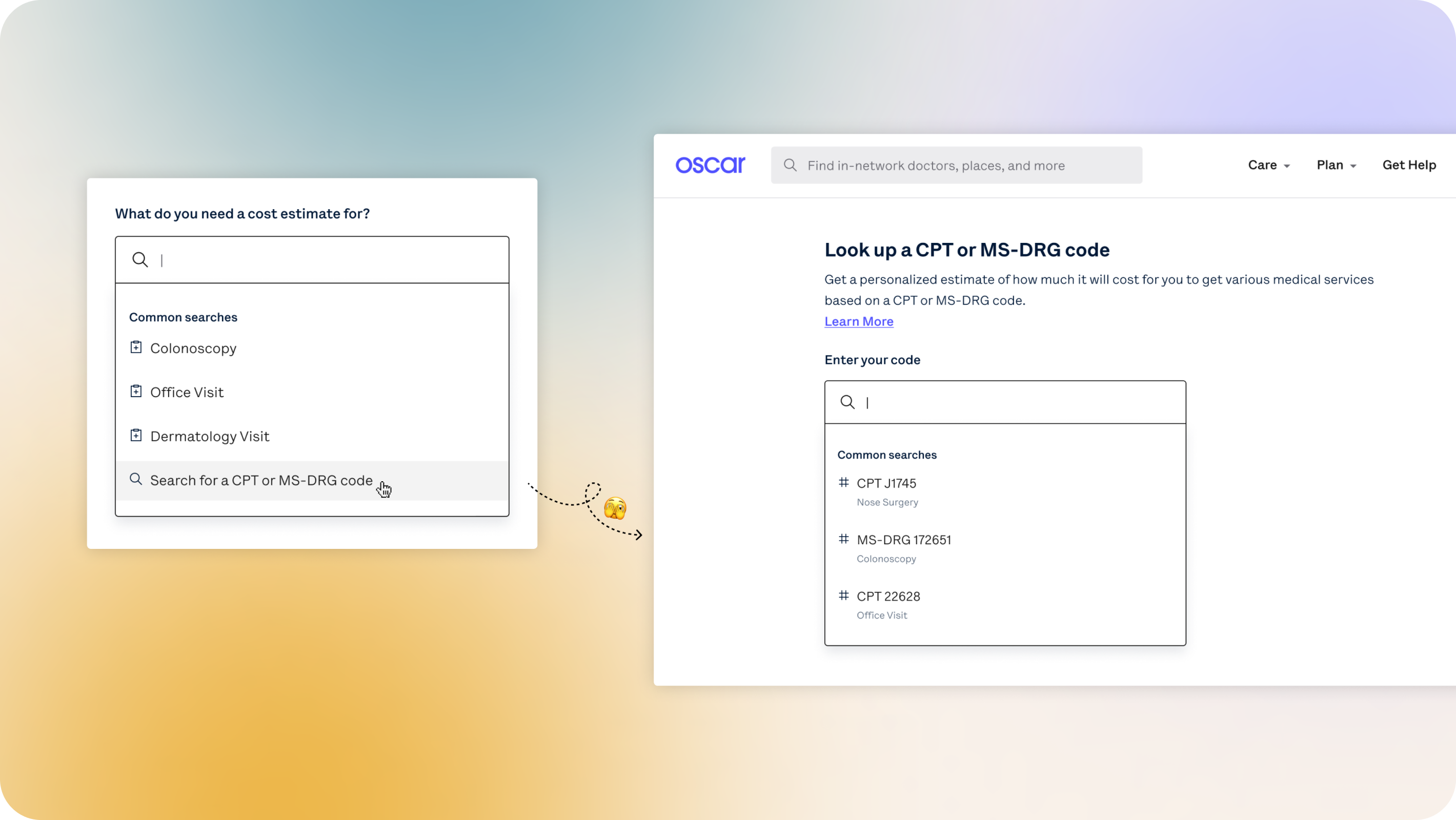
November
Compliance work is unavoidable in healthcare, but at Oscar we try to keep it member-centric. “How can I approach this project as a way to empower our users?” In November, new guidelines from the Center of Medicare Services required us to add CPT codes (medical codes that help identify medical services and procedures) to our cost estimates tooling. This meant that I had a chance to iterate on a critical member-facing tool for our members to access full cost transparency.

January
After the holidays, we returned to analyze results from the self-service experiments we ran in September – a great way to start off our design explorations for the new year!Looking forward
Our goal this year as a pod continues to be clarifying the healthcare system through the lens of promoting self-service, trust and transparency. With all the foundational research and experiments we conducted last year, I wonder – how will this new knowledge pave the way for a better user experience?It’s been an incredible learning experience at Oscar so far, and I’m grateful for the chance to have worked with some of the best product designers around. The next year looks promising and I can’t wait for what’s to come!
Special thanks to Sarah Mitrano, Gabi Lawrowska, Michael Farley and Craig Damrauer. Huge shoutouts to the DMX Trust & Transparency team.

©2022 Oscar Health