6.22.21 • By Dani Balenson
How we redesigned the Oscar brand to speak to our growing member base
How we redesigned the Oscar brand to speak to our growing member base
Oscar started as the easy-to-understand health insurance for every freelancer in New York. As the company grew, expanding its network and deepening its tech, the visual identity needed to grow as well.
The brand team worked alongside pals at Franklyn to build a brand that resonates with members of all ages, locations, and languages, and is vibrantly human within the humdrum health insurance industry. Here’s how we did it.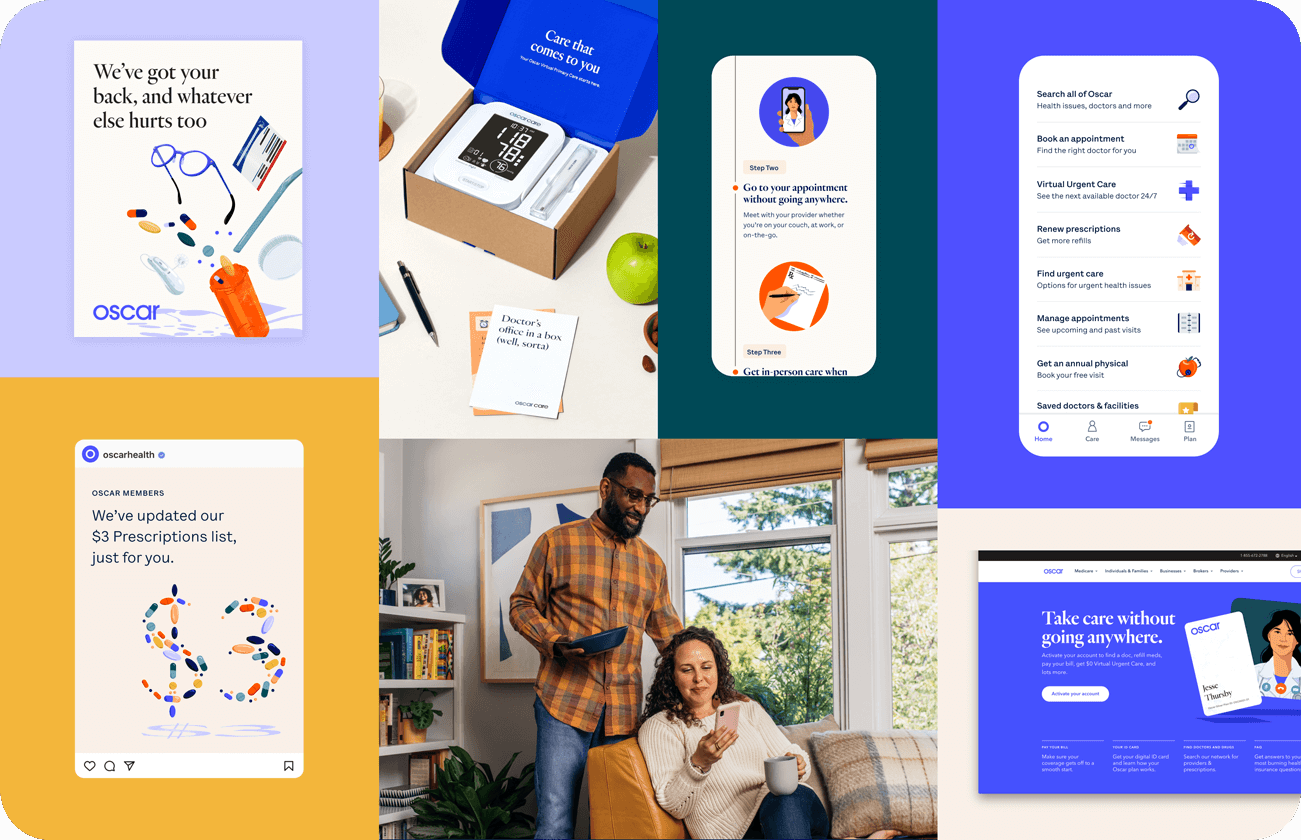
Brand philosophy
Oscar’s mission to make a healthier life accessible and affordable for all meant that our identity needed to represent all people, while also representing the craft, humanity, and innovation that goes into our tech and our approach to care.Like most brand refreshes, we started with distilling our brand strategy into attributes that would help guide our creative expressions. We landed on:
Clear: We talk with human terms and never with jargon. Our communications are easy to understand, and to the point.
Caring: We have our members best interests at heart. We support people having better experiences, better care, and better outcomes.
Credible: As a health insurance company, members need to feel like they can trust us—that they can rely on us to work for them. We mean what we say and we’re not afraid to admit our mistakes.
Diverse: Healthcare is complex and there is no one answer that works for everyone. We see the many facets to the problem and the many facets to a solution.
Inventive: We were born through using technology and data in new ways. That spirit is how we make smarter decisions that make care that much sharper—and as a brand, we think of expressing care in original, clever ways.
Imperfect: We are never perfect and humbly accept the quirks, dents and scratch marks that make any human endeavor that much more human.
Our brand house
We realized that we needed to understand how our visual identity would flex holistically before we got into actual hands-on design. So, we leaned into the analogy of our brand as a “brand house.”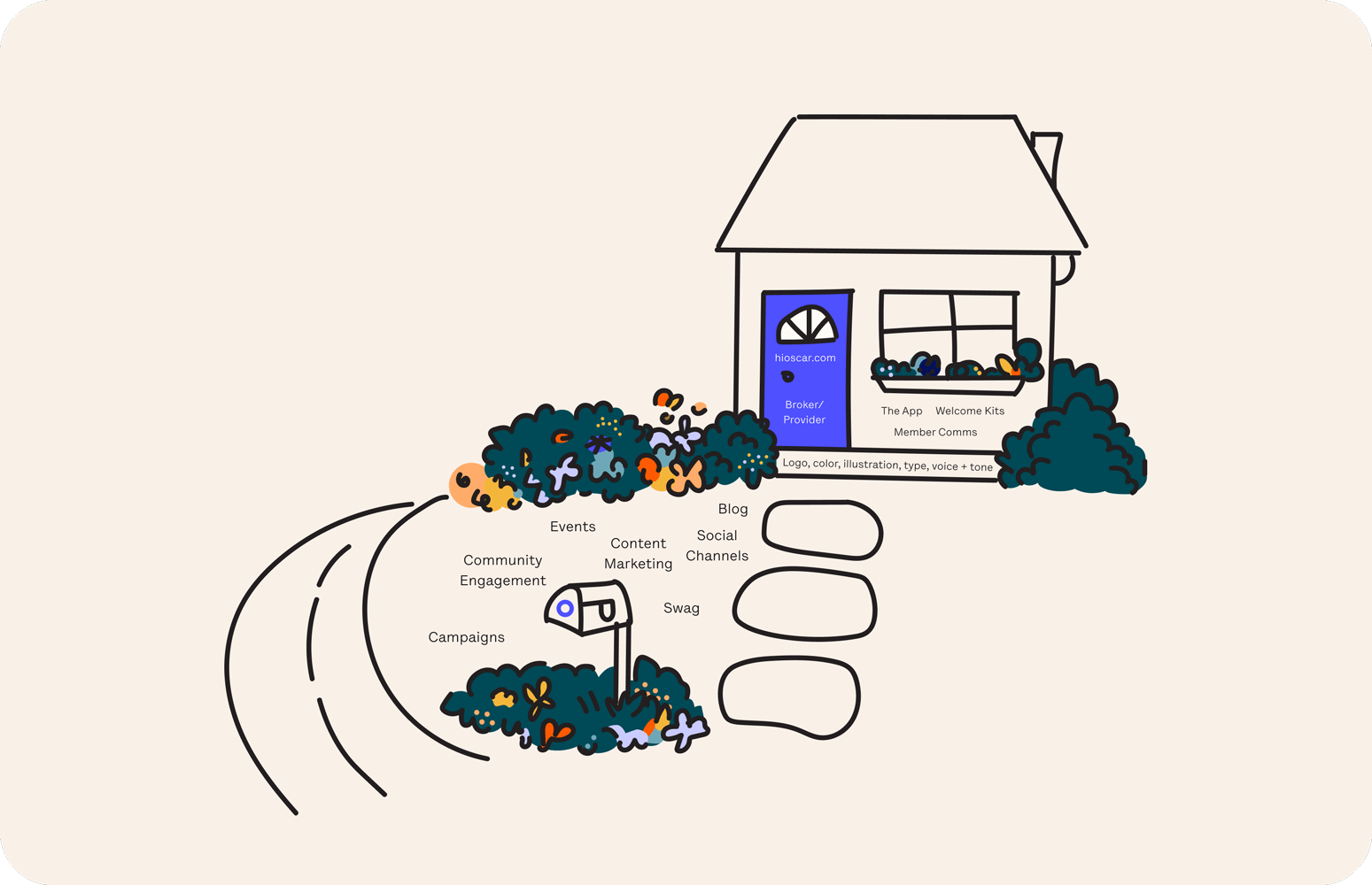
What’s a brand house? Glad you asked! Picture a house with a beautiful garden that sits on a meandering road. When our audience is walking down the road, we want them to see our lovely garden (made up of flowers that bloom year after year, like unique campaigns and experiential moments) and think it’s pretty nice.
As they mosey up our walkway and look at the garden, we want them to be excited to come into our house. When they knock on our front door (akin to our website and broker/provider materials), we want them to know who we are.
Then, when they’re inside (e.g. throughout our app, welcome kits, and consistent member comms), we want them to feel at home. All of this is built on the foundation of color, typography, voice & tone, illustration, and our brand attributes.
This is to say that things further from our front door, like live-action commercials or varying illustration styles, can flex away from our core identity and change frequently. Things inside the house should be true to the foundation and remain recognizable over time. This approach helps orient our audience at all times—so that they know they’re hanging out at Oscar’s house.
Color palette
Into the building blocks! We updated Oscar’s original calling card of royal blue to a new blue, affectionately dubbed Hot Blue. Hot Blue has a little more zing, without throwing away hard earned brand equity.
Because health insurance is a field in which the brand has to deliver hard news, as well as good news, brand designer Cathy Lee developed a color palette that can shift into various tonal combinations that feel genuine to the content being communicated. The flexible color palette supports vibrant scenes in our illustrations, clothing choices for any live-action needs, and UI in our product as well.
Illustration style
The Oscar brand has always had roots in industry-defining illustration. Together with superstars and friends at Franklyn, we shaped a style that shows real people, doing real things, with real human emotions—without losing the charm, magic, and wit of Oscar. Floating objects, detailed scenes layered with opportunities for interaction, and visible brush strokes...oh my! The craft and care that goes into our member experience is visually reflected in our illustration.
The biggest thing we aimed to accomplish with style was not making our illustrations overly flat and abstract, as we had research findings from our older audiences that indicated that the ever-present tech illustration trends felt like they weren’t for them. We wanted to be inclusive of all our members from the get-go.
A fun challenge was taking a style that can be super detailed and systemizing it into 4 levels of scale, so that it could fit into all the nooks and crannies of the brand experience. Our full-bleed scenes, spot illustrations, marketing icons, and product icons all have distinct purposes within the brand but feel united through color and style.

Typography
One of the most impactful changes from this work was updating our typefaces. We use Heldane by Klim type—an upright and quirky serif—paired with Lettera by Lineto—a conversational, almost monospaced grotesque sans serif. Together, the two typefaces help the Oscar brand speak in all the ways it needs to. Heldane brings maturity and authority, while Lettera is warm, approachable, and veers towards tech.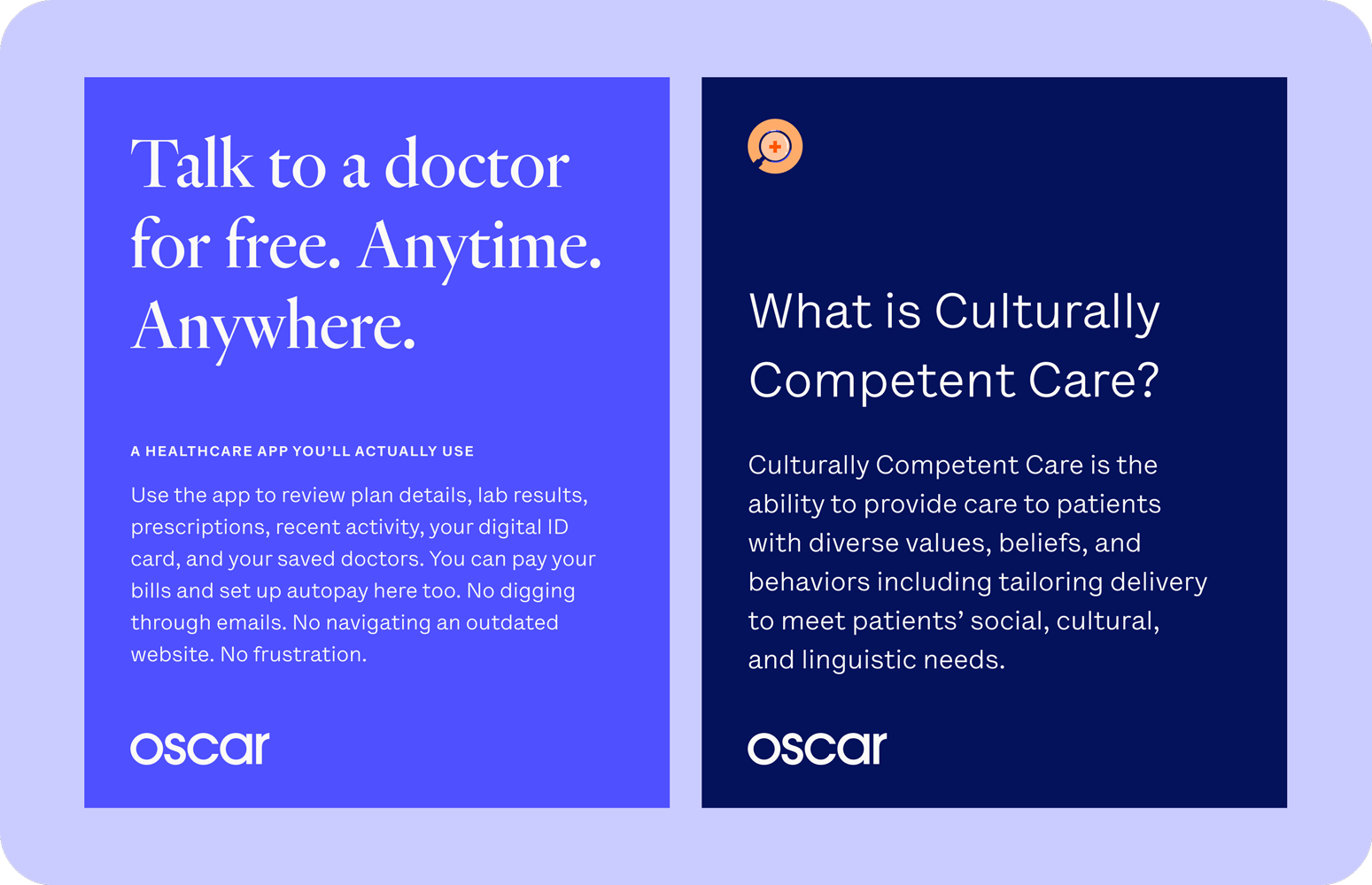
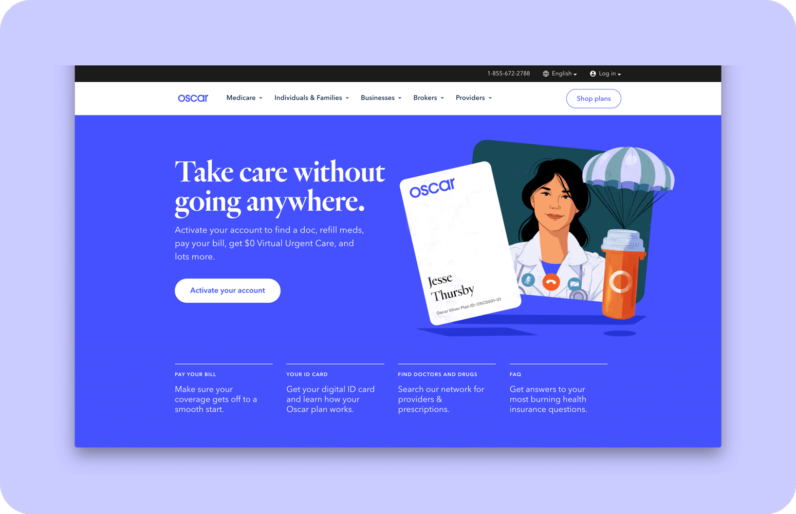
The shift from the clinical tone of the original body typeface, Avenir, to the conversational tone of Lettera has been most notable on hioscar.com, which was cleanly and efficiently updated by our wonderful Product Design team <3
Voice and tone
Talking about typefaces is an excellent segway into the voice and tone portion of our refresh. While it’s historically never been particularly enjoyable to hear from a health insurance company, Oscar aims to change that. Our Creative Director, Craig Damrauer, updated our voice and tone to build on our brand attributes while adding new ones: Surprising, Clever, and Witty. This combination is what makes people perk up a little, listen, and want to stick around to hear more.

Our messaging, in any application, is centered around the member. We want to get someone’s attention right away, while focusing on the benefit or value being communicated. We aim to say one thing and say it well, keeping in mind what we want people to remember from each interaction.
And really, no jargon.
Photography
Okay, one of the more crazy things we did during the refresh was to pull off a 4-day covid-safe remote shoot to create a photo library of ~50 images, again with pals Franklyn and Kyle Johnson. While illustration can speak to many concepts related to our offering, we also know that our members are real people with real lives. And photography shows that most clearly, bringing dimensionality and reality to our brand ecosystem.
The photos speak to Oscar’s main lines of business: Individuals and Families, Medicare Advantage, and Small Business. Throughout all of our photography, care has an underlined presence. We don’t lean on post-production tricks or heavy styling, either—we frame real life moments that our members experience. The resulting collection is bright and exuberant, with brand colors shining through in wardrobe (and beautiful natural light throughout).
In action + the future
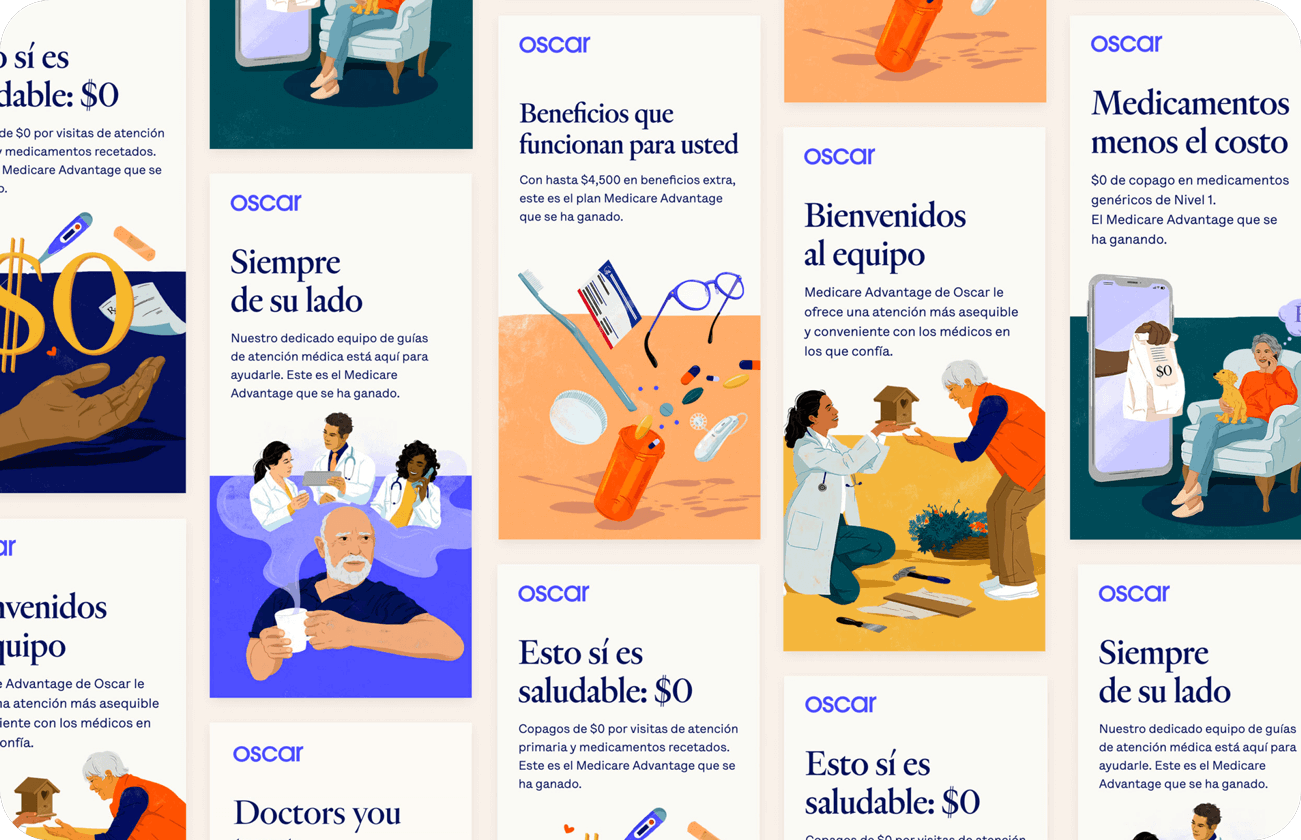
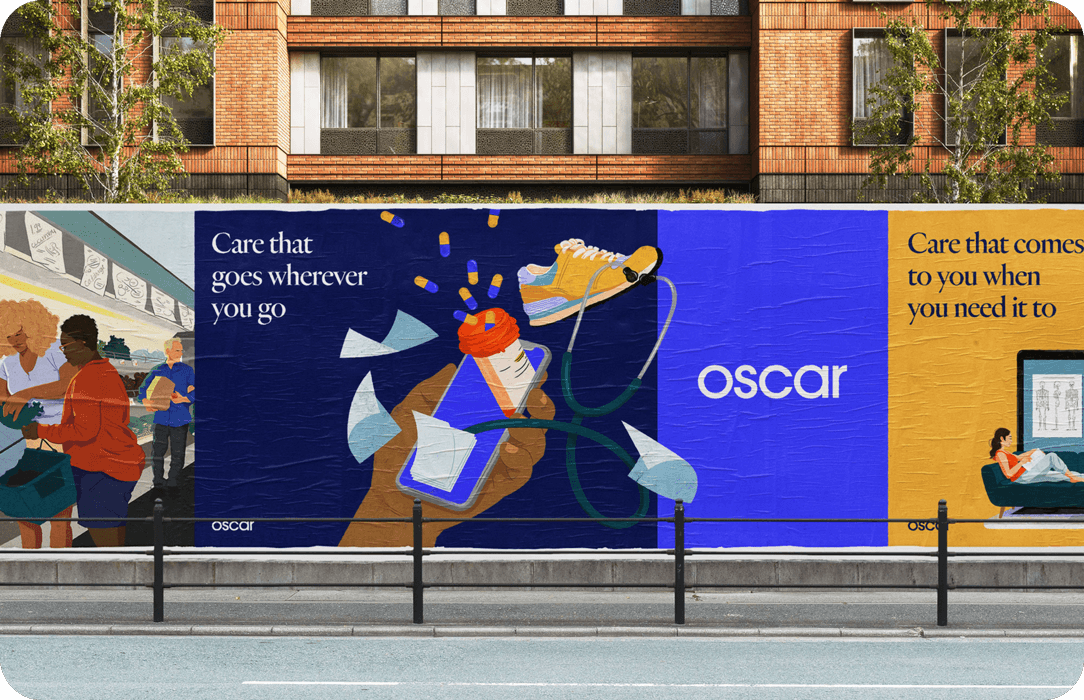
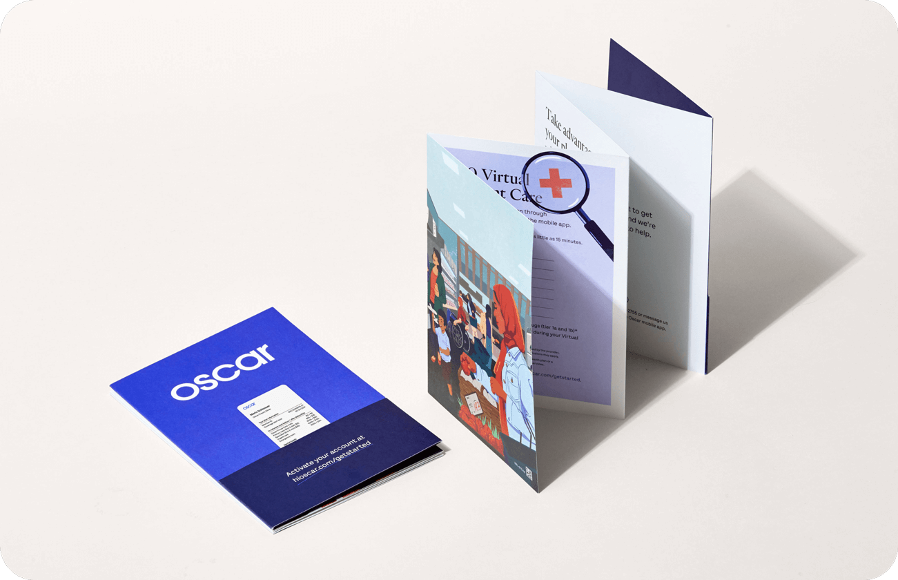
Without any more words, here’s a bunch of the way’s we’ve implemented the brand across various executions. The future is exciting. We see a lot of ways for the brand to expand and engage with members in meaningful ways, as well as opportunities for us to tighten up places where it's breaking or where some decisions aren’t working out. As Oscar grows and changes, so will the brand identity. We’re really happy to be able to share the foundation here!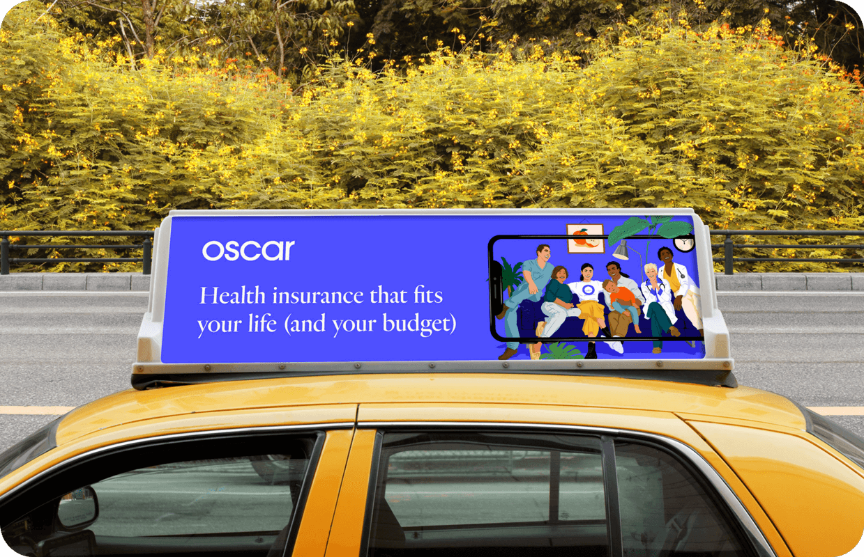

While my name is in the byline, this was a giant project that so many people brought to life.
Oscar team: Cat Lee, Kate Apostolou, Topher Lorette, Libby Denault, David Mikula, Craig Damrauer, Carmela Ciuraru, and Jon Wilson.
Franklyn team: Ashley Van Belle, Michael Freimuth, and Tess Havas.
