6.22.22
By Emili Hsu & Herry PierreLouis
A new front door to our digital member experience
In the past few years, Oscar’s business has evolved in significant ways: we’ve dramatically expanded our footprint from a handful of urban areas to 600+ counties across 22 states; we super-charged our small group business; we launched our first Medicare Advantage plans; and we unveiled +Oscar, our platform offering, which now serves multiple clients spanning tens of thousands of members. Last year, we took stock of our home experience and concluded that it needed to evolve too.
Not only has our business become more varied, our membership has become more diverse too, thanks to significant market share gains in South Florida and a growing proportion of Spanish speaking members. Today we have a wide variety of members, with differing levels of care needs, familiarity with insurance, and comfort with technology. It’s more important than ever that we design our digital experiences to meet them where they are.
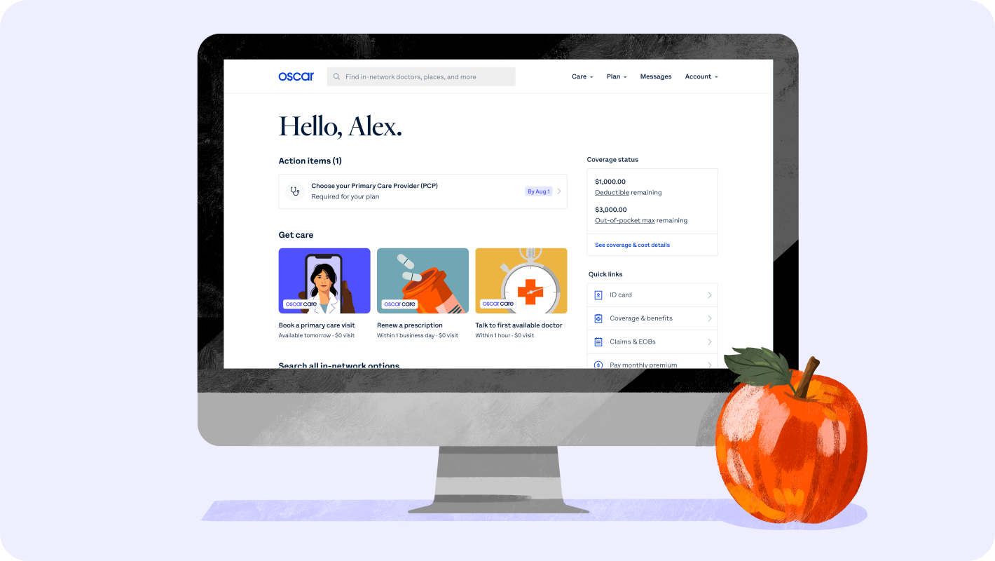
As the member homepage is a first impression of our digital member experience, and the starting point of wayfinding for important care and plan information, we zeroed in on it as the place to start experimenting with a fresh approach, both in our design and our code. Our goal: Build a new homepage from the ground up that would enable us to deliver a simple, personal, and easy-to-use experience for all members.
As the member homepage is a first impression of our digital member experience, and the starting point of wayfinding for important care and plan information, we zeroed in on it as the place to start experimenting with a fresh approach, both in our design and our code. Our goal: Build a new homepage from the ground up that would enable us to deliver a simple, personal, and easy-to-use experience for all members.

Member feedback quotes
We also sent out a survey to members on their usage of our website and mobile app, what they liked and disliked, and what their ideal homepage would include. We compared these self-reported responses to our product analytics data and considered how they corroborate or contradict.
Additionally, we conducted a broad competitive analysis of digital products. We noted industry-specific insights as well as more general references on navigation and wayfinding, content discovery, and treatments of personalized information.
Additionally, we conducted a broad competitive analysis of digital products. We noted industry-specific insights as well as more general references on navigation and wayfinding, content discovery, and treatments of personalized information.
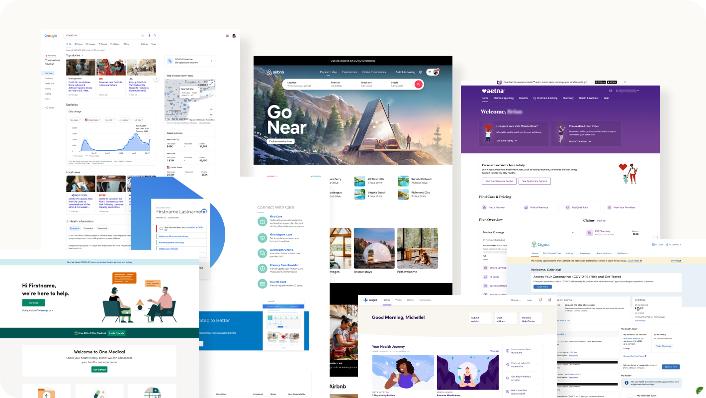
Comps
To get a balanced view of business needs and pain points, we interviewed 12 internal stakeholders across product, engineering, marketing, population health, customer service (including Care Guides), and more.

Stakeholder interviews
Defining goals and mapping out solutions
It was important that we balanced both addressing members’ needs and Oscar’s business goals. With that in mind, we synthesized the research and aligned on formulating overarching project goals around activation and retention (using the AARRR pirate metrics framework):- Increase explicit member satisfaction
- We found that difficulty in wayfinding was a top member pain point. Members complained about having to hunt for general plan and coverage information as well as specific situationally-relevant items.
- By Improving navigation and wayfinding for common intents and surfacing more contextually relevant items, we hoped to increase explicit member satisfaction and build member trust.
- Increase adoption of “flywheel” features
- We want members to find and utilize care options that best fit their needs. The existing homepage offered little context for each care option, making it difficult for members to compare and choose.
- By providing better framing and organization of care options, we hoped to drive members to try options such as Oscar Primary Care, a feature we built around addressing members’ longitudinal care needs. Part of what makes Oscar’s digital experience powerful is how adoption of one feature can fuel adoption of another, creating a virtuous cycle of engagement that we can harness to thoughtfully guide healthcare decisions. The adoption of flywheel features will therefore provide long-term value for members and the business.
- Enable configurability and personalization
- Members want to see more personalized information–we’ve seen evidence of this in our highly targeted communications, with NPS increasing the more we engage. Meanwhile, showing content that is not relevant to the member deteriorates trust and confidence. As our membership diversity has increased, we needed a configurable homepage that supports different content permutations in order to serve all our members.
- A modular design would enable us to customize the homepage for members across demographics, locations, plan types, and more. It would also allow for more nimble product experimentation with reduced overhead.
Putting design iterations to the test
We explored several design concepts, including:- User-customizable shortcuts
- Exploring shifting focus between plan-related and care-related content
- Different methods of grouping and framing care options
- Different methods of surfacing personalized information
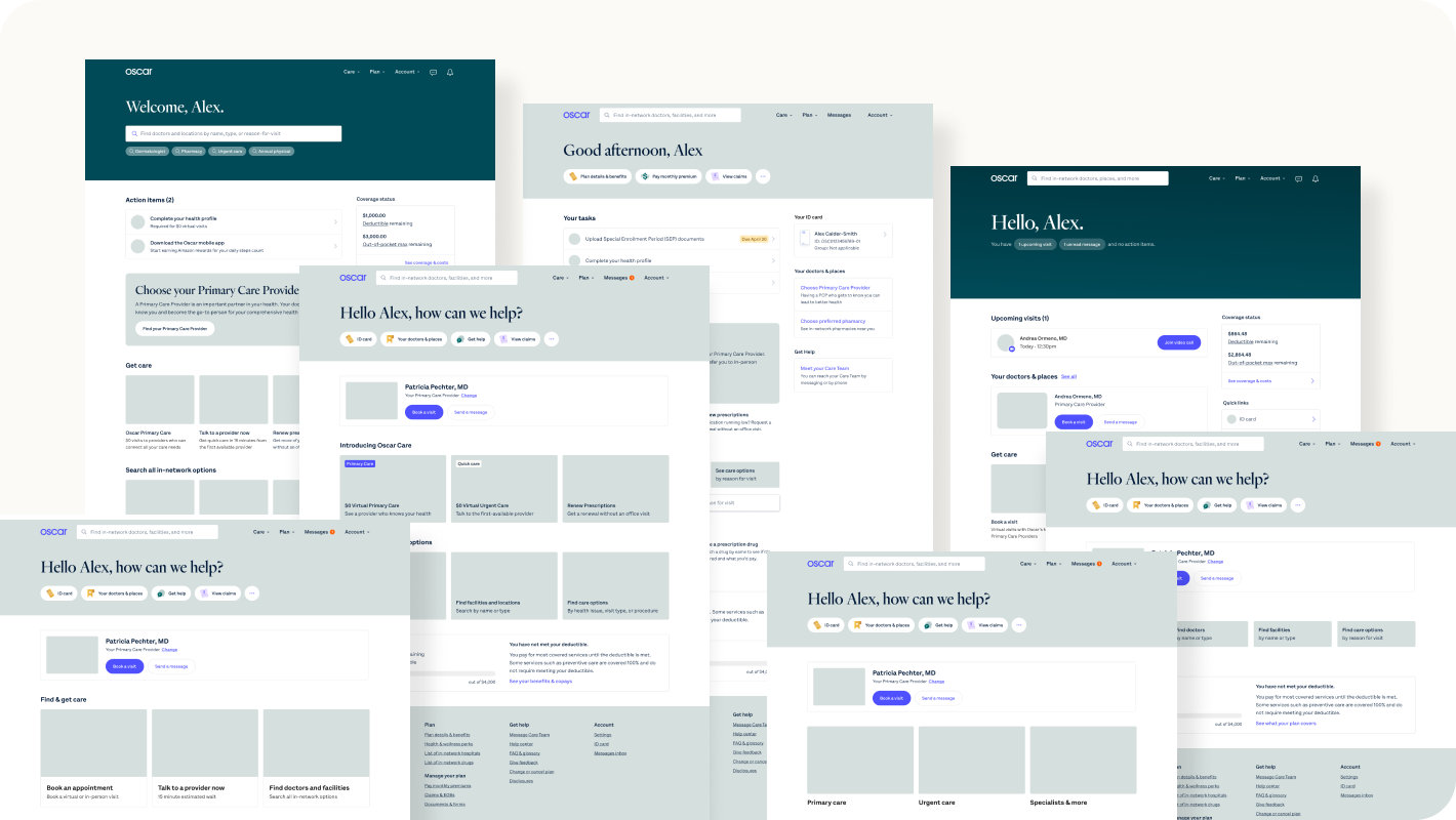
Design concepts
After several rounds of iterations and feedback from product, design, and engineering, we tested prototypes with real members. Major findings include:
- Very positive responses to surfacing situationally-relevant content, such as upcoming visits and action-required items
- Split responses using a search bar VS selecting between structured options
- Quick links were successful as entry points to access common intents
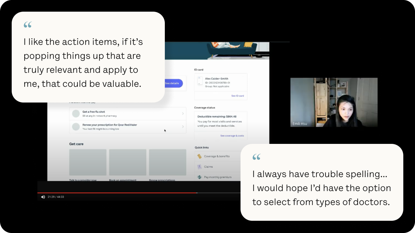
User testing
We incorporated these learnings into the final design iteration, which went through several weeks of collaboration with brand, engineering design and implementation, and QA. Then it was time to launch an A/B test experiment between the old and new homepage!
Results and learnings
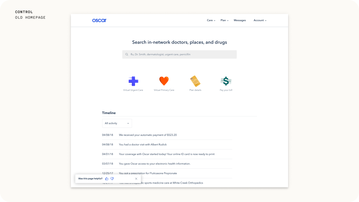
Control: old homepage
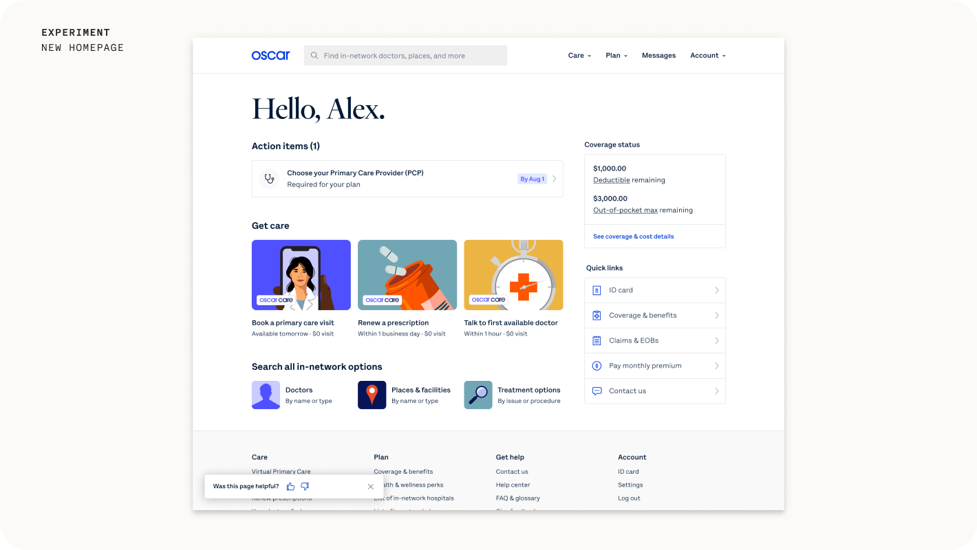 Experiment: new homepage
The goal of a product experiment or A/B test is to try to get to causal inference. We wanted to understand the direct impact of our changes and use that data to inform future decisions. Due some of the adoption metrics being lower volume in nature (e.g. scheduling a virtual primary care visit), we allotted an experiment duration of two months to increase the likelihood of achieving statistically significant results. In order to measure the impact of our changes against our project goals, we analyzed the following metrics using our A/B testing framework:
Explicit member satisfaction
Explicit member satisfaction
- Percentage of positive responses to our homepage pulse point, the floating feedback prompt on the bottom left of the page.
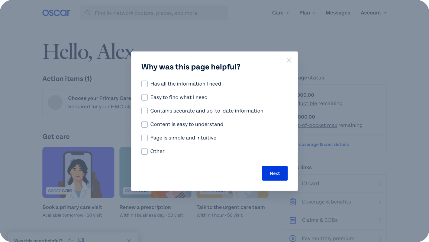
Pulsepoint feedback
The vast majority of users on the homepage clicked on a call-to-action or a navigational entry point whereas a small subset engaged with the pulse point feedback prompt (which is typical for in-app feedback collection). The sample size of pulse point responses therefore was borderline in terms of statistical significance. Encouragingly though, users of the new homepage were ~20% more likely to indicate that the page made it “easy to find what I need”, suggesting that our navigational improvements were well received.
Product adoption
Product adoption
- First time usage of flywheel features (Virtual care offerings, Care Router, and Secure Messaging) after a homepage visit.
- Completion of Action Items on the homepage.
In terms of product adoption, we achieved positive results across many of our core KPIs. We observed a significant lift (over 5% increase) in adoption of two of our three flywheel features: Care Router and Secure Messaging. We also saw positive signs of adoption of other core features, but they were not statistically significant.
Most notably, we observed significant user adoption of Action Items, a module that prompts members to complete important tasks. We benchmarked user engagement with Action Items against existing mediums used to prompt task completion: primarily emails and app notifications. For the use case of prompting members to choose a Primary Care Provider, the homepage Action Item had over 3X the engagement rate compared to the email campaign.

PCP selection action item
What’s next?
The modularity of the new homepage allowed us to quickly respond to hyper-growth during our latest Open Enrollment period, customizing components to direct new members to the information they needed most. It will also enable us to continue to experiment and evolve the homepage as we learn more about our members’ and clients’ differing needs. As next steps, we plan to invest in our task infrastructure to generate more targeted and relevant Action Items, and to leverage our learnings here in launching a new experience on our mobile app as well.
©2022 Oscar Health